Stores Are Designed to Empty Your Wallet: Here's How to Walk Out With What You Actually Came For
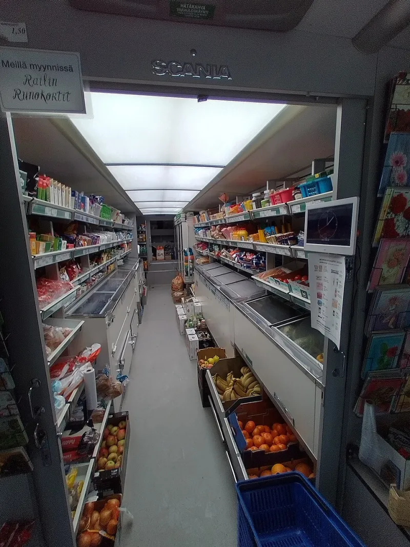
Photo: Veikk0.ma, CC BY-SA 4.0, via Wikimedia Commons
Here's something worth sitting with for a second: the grocery store, the big box retailer, even your favorite clothing boutique—none of them are arranged for your convenience. They're arranged for your spending. Every fixture, every bulb, every strategically placed end cap is the result of years of retail psychology research, all pointed at one goal: getting more stuff into your cart before you reach the register.
The good news? Once you understand the game, it gets a lot easier to play on your own terms.
Why You Always Turn Right (And Why That Matters)
Walk into almost any American retail store and notice what happens when you step through the entrance. You'll likely drift to the right. This isn't coincidence—it's design. Most shoppers in the US naturally veer right upon entering, and retailers have built their floor plans around this tendency for decades. The result is a carefully curated path that pulls you through high-margin departments before you ever reach the basics you came in for.
Grocery stores are the classic example. Staples like milk, eggs, and bread are almost always tucked at the back or far corners of the store. You have to walk past hundreds of other products to get there. That journey is intentional. The longer your path, the more items catch your eye, and the more likely something ends up in your cart that wasn't on your list.
Big box retailers like Target and Walmart use a similar approach with what the industry calls a "decompression zone" near the entrance—a wide, open area with minimal product that lets your brain settle in and shift into browsing mode. By the time you're actually shopping, you're already primed to linger.
What the Lighting Is Really Doing to You
Retail lighting is one of the most underrated manipulation tools in the business. It doesn't just make the store look nice—it actively changes how you perceive products and how long you stay in a section.
Fresh produce sections in grocery stores are bathed in cool, bright light that makes fruits and vegetables look more vivid and appealing than they might under standard fluorescent bulbs. Meat cases use a reddish-pink tint to make cuts look fresher. Bakery sections often glow with warm, amber lighting that makes everything look like it just came out of the oven—even if it didn't.
In clothing stores, fitting room lighting is frequently warmer and more flattering than what you'd encounter at home. That blazer looks different under soft, directional light than it will in your bathroom mirror the next morning. Jewelers take this even further, using precision spotlights to maximize sparkle and brilliance in ways that natural light simply doesn't replicate.
The practical takeaway: if you're making a significant purchase, try to evaluate the item in different lighting conditions—or at least acknowledge that what you're seeing in-store may not match your everyday reality.
The Shelf Position Hierarchy You've Never Been Told About
There's a reason certain products sit at eye level and others are crammed onto the bottom shelf. Retailers charge brands a premium for prime shelf real estate—specifically the zone between roughly waist height and eye level, which researchers have confirmed gets the most attention from shoppers.
Eye-level products tend to be name brands with higher margins. Budget options and store-brand alternatives are almost always lower, requiring you to crouch down and make a deliberate choice. This is especially true in grocery and pharmacy aisles. If you're willing to look down (or up), you'll frequently find the same or comparable product for meaningfully less money.
End caps—those displays at the end of each aisle—are another layer of this. They feel like deals because they're prominently displayed, but many end cap products aren't discounted at all. They're simply paying for visibility. Always check the per-unit price before assuming an end cap is a bargain.
How Color and Smell Work Against Your Budget
Color psychology is well-documented in retail. Warm tones like red, orange, and yellow create urgency and stimulate appetite, which is why fast food signage and sale tags lean heavily on them. Cool blues and greens signal calm and trust, which is why banks and pharmacies favor them. Luxury retailers often strip back color entirely—minimalist white or neutral palettes signal exclusivity and encourage slower, more deliberate browsing (which means more time in the store).
Then there's scent. Grocery stores pipe in the smell of fresh bread or roasting chicken not because something is actually baking nearby, but because those aromas trigger hunger and emotional comfort, both of which loosen the purse strings. Home goods stores use pleasant ambient fragrances to make shoppers feel at ease and more likely to imagine products in their own homes. It sounds almost comical, but the research backs it up—scent marketing is a real and growing field.
Spotting the "Convenience" Trap
Retailers are masters at engineering what feels like convenience but is actually a nudge toward spending more. Pre-made meal kits placed right next to the raw ingredients. Phone cases displayed directly alongside the phones. Batteries hanging right next to the electronics that need them. These adjacencies feel helpful, but they're calculated to trigger impulse additions to your cart.
Checkout lanes are the final frontier of this strategy. The candy, magazines, and small impulse buys lining the register area aren't stocked for your benefit—they're there because you're stationary, mildly bored, and your decision fatigue is at its peak after a full shopping trip. This is also why many retailers have introduced self-checkout as a default: it keeps you moving, but it also removes a human touchpoint that might have caught a duplicate item or reminded you to use a coupon.
Practical Tactics to Shop With Intention
Knowing all this is useful, but what actually changes your behavior at the store? A few concrete things:
Write a real list before you go. This sounds obvious, but specificity matters. "Snacks" is an invitation for the store to decide for you. "One bag of trail mix, under $5" is a decision you've already made.
Set a rough budget by category, not just a total. If you know you're spending $20 on produce, you're less likely to get derailed by a beautiful end cap display of specialty cheese.
Use a basket instead of a cart when you can. Physical weight creates a natural limit on impulse buying. Carts, especially the oversized ones that have become standard, make it psychologically easy to keep adding.
Avoid shopping when hungry or rushed. Emotional states dramatically increase susceptibility to the design cues above. A calm, well-fed shopper is a harder target.
Compare prices by unit, not package. The larger display or flashier packaging is often a distraction from a worse per-ounce or per-count price.
Pause at end caps and impulse displays. A two-second conscious check—"Is this on my list? Do I need this?"—is often enough to break the automatic grab reflex.
Retail environments are sophisticated, and the people designing them are genuinely good at their jobs. But none of these tactics work on a shopper who sees them coming. The store layout is a map—you just need to know who drew it, and why.