How Stores Herd You Toward the Most Expensive Items — And the Simple Moves That Break the Pattern
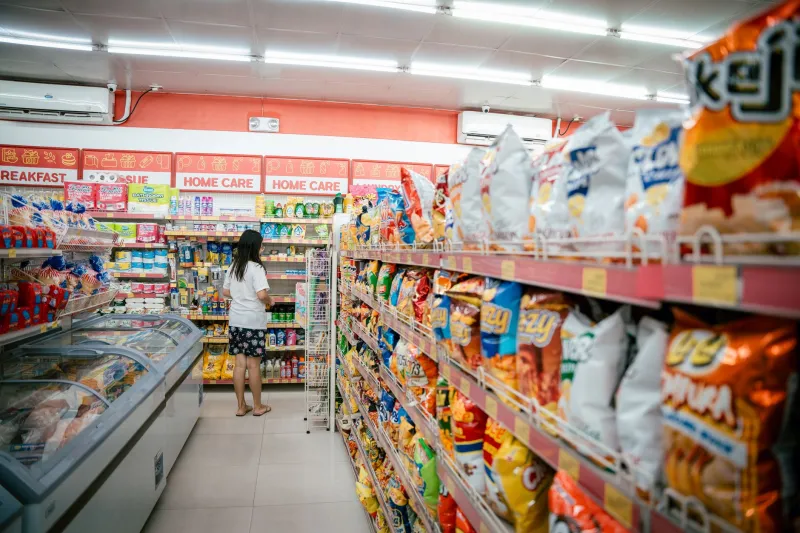
Walk into any major retailer in America and you're stepping into a machine. The lighting, the music, the height of the shelving, the placement of the restrooms — none of it is random. Retail design is a legitimate field with decades of consumer psychology research behind it, and every square foot of floor space has been optimized with one goal: to get you spending more than you planned. The same logic applies online, where algorithms and interface design quietly push you toward products with the fattest margins.
Here's the good news: once you see the pattern, you can't unsee it. And once you can't unsee it, you can start working against it.
The Counterclockwise Conspiracy
Most American grocery and big-box stores are built around a counterclockwise traffic flow. You walk in on the right side and naturally drift left as you move through the space. This isn't a coincidence — studies in retail anthropology, including well-known research by consumer behavior consultant Paco Underhill, have shown that shoppers in the US tend to favor right-hand product placement and right-side browsing due to the direction we drive and walk.
Retailers exploit this by placing high-margin departments — floral, bakery, prepared foods, premium electronics — right at the entrance and along the primary traffic path. The items you actually came in for, like canned goods, basic staples, or budget-tier products, are tucked deep in the store. You have to walk past a gauntlet of temptation to reach them.
The fix? Go left first. Deliberately start your shopping trip on the opposite side of the store from where you'd naturally begin. You'll hit sections the store doesn't particularly want you to linger in, which often means less visual clutter, fewer impulse displays, and a clearer head when you get to the stuff you actually need.
Endcaps Are Not Sales — They're Billboards
Those displays at the end of every aisle look like deals. They're staged to look like deals. Bright signage, stacked product, sometimes a bold price in red. But here's the thing: endcap placement is often paid for by brands looking to move specific SKUs, and the items featured there are frequently priced at or above their regular shelf price.
A 2020 study published in the Journal of Retailing found that shoppers consistently overestimated the discount on endcap products compared to mid-aisle items. The visual cue of "featured placement" reads as "good deal" in our brains, even when no actual discount exists.
Before you grab anything off an endcap, walk down the aisle it's anchoring and check the standard shelf price. You'll be surprised how often the "featured" product is the same price — or more expensive — than what's sitting quietly on the regular shelf a few feet away.
Seasonal Rotations Keep You Off Balance on Purpose
Ever noticed that your grocery store rearranges its layout every few months? It's not a renovation. It's a tactic. When a store moves products around, you lose your mental map of where things are. Instead of walking directly to what you need, you wander. And wandering shoppers buy more.
Seasonal display rotations — think back-to-school setups in July, holiday candy in October, Valentine's displays in January — serve double duty. They create urgency ("get it before the display is gone") and they physically disrupt your usual route through the store, exposing you to products you'd otherwise walk right past.
The counter-move here is to use the store's app or website before you go in. Most major chains — Target, Walmart, Kroger, Meijer — let you search for specific items and will show you the aisle location. Build your list in aisle order so you can move through the store in a straight line rather than zig-zagging past the displays designed to slow you down.
The Checkout Line Is a Final Boss
You made it through the store. You stuck to your list. And then you stand in line for four minutes staring at a carefully curated wall of candy bars, travel-size products, magazines, and impulse trinkets priced just low enough to feel harmless. This is intentional.
The checkout zone is prime real estate. It's where your defenses are down — you're tired from shopping, you're mentally done, and a $2.49 snack feels like nothing after a $200 cart. Retailers know this. The items placed at checkout have some of the highest impulse-buy rates in the entire store.
Self-checkout lanes are often designed with the same psychology but less product density, which is one reason some shoppers find them easier to get through without grabbing extras. If impulse buying at checkout is a consistent problem for you, self-checkout might actually be worth the occasional wait.
How Online Stores Run the Same Plays
Think you're safe from layout manipulation when you're shopping from your couch? Not quite. E-commerce sites use the same principles, just translated into digital design.
Default sorting on product pages almost never shows you the cheapest items first — it shows you "featured" or "sponsored" results, which are paid placements. Filtering options are often designed to highlight premium tiers. "Best Sellers" lists are curated, not purely algorithmic. And the homepage banners promoting "limited time deals" frequently feature items with inflated original prices.
The habit to build: always change the sort order to "Price: Low to High" as your first move on any product page. This single action immediately reorganizes the entire page around your actual interest rather than the retailer's margin goals. Also, skip the homepage entirely when you can — go straight to a category page or use the search bar with a specific product name rather than browsing curated collections.
Use the Store Against Itself
Here's the meta-move that ties all of this together: use the store's own tools — loyalty apps, price checkers, digital coupons — to extract value from a system that wasn't built to give it to you. Every major US retailer has a free app now, and most of them include features like price history, digital coupons that load directly to your account, and aisle-specific wayfinding.
At stores like Kroger, Safeway, or Target's Circle program, the best discounts are often only accessible through the app. The store is essentially charging full price to people who don't bother to engage with the system. That's a penalty for not paying attention, and it's an easy one to avoid.
Knowing where deals actually live — not where the store wants you to think they live — is the whole game. Endcaps aren't it. Seasonal displays aren't it. The checkout wall definitely isn't it. The real value tends to be buried in the middle of the aisle, in the app's clipped coupons, or in the clearance section that most shoppers walk past because it doesn't look exciting enough.
Shopping smart isn't about being suspicious of every display — it's about understanding the environment you're in and making deliberate choices instead of reactive ones. The store layout was built to guide you. You're allowed to go a different direction.